
Date input script component
Date/time is an input component that you can use to select a date and optionally, a time and time zone. When an agent clicks the component in a script, a calendar appears. Depending on the component properties, the time and time zone input fields can appear. A variable stores the date and time the agent selects.
-
Click Date/Time on the component toolbar.
-
To store the date that an agent selects in a variable, expand the Common properties group.
-
Under Value, select a string variable. This binds the value that an agent selects by using the date component to the variable. When an agent selects a date, the bound variable stores that date. Conversely, if the bound variable’s value is set before the page is displayed, then the component displays the current value of that variable.
Note:For example, if an agent selects August 8, 2017 from the calendar, it stores the following DATETIME value in the bound variable:
2017-08-07T00:00:00-0400. The format of the date string is:yyyy-mm-ddplusTto indicate time inhh:mm:ssformat, followed by the offset to Coordinated Universal Time (UTC). -
To configure the input control to prompt for date, time, and time zone, or for only the date, enable or disable Includes Time.
No When you set this option to No, the agent can select a date, but cannot enter a time or time zone.
Yes When you set this option to Yes, the agent receives a prompt to select a date, time, and time zone.
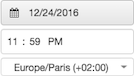
Tip: To set a callback time, the agent must select the contact’s time zone.
-
Set any other properties of the component.
CommonValue binds a component to the variable selected. For example, if you bind a text input component to a variable, the input box will always display the value of that variable, ignoring any placeholder text specified. The variable is automatically updated with text typed by the user, subject to validation processing.
Other controls, radio buttons for example, use Value with a Selected Value Text setting. When the radio button is selected at runtime, its "Selected Value Text" becomes the new value of the variable. This way, each radio button can assign a different value to same variable.
When a calendar control is bound to the variable, its value is set to the date selected by the control. Since variables can preset the value of visual controls and also be set by them, binding is a powerful and often-used technique.
The Includes Time setting configures a Date/Time component to prompt for date, time, and time zone, or just a date.
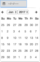
No When set to No, the agent is prompted to select a date only. When clicked, a popover calendar of dates appears for the agent to choose from.
Yes When set to Yes, the agent is prompted to select a date, time, and time zone.
Tip: When setting a callback time, the agent should select the time zone of the contact.
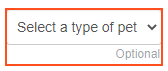
Determines whether the user is required to type or select a value. The default is False, which means that user interaction is optional.
The user interface visually indicates whether user input is optional.
Optional input is indicated by a label below the component:
Layout
Configures width to a fixed size, to grow as needed to display content, or to consume as much space as possible relative to other components, using weighting to influence size adjustments.
Setting Description 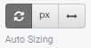
Auto-sizing configures the component to shrink or grow in accordance with its contents. For example, the width of a label can grow depending up on how much text it contains. 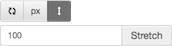
Stretch allows a component to consume as much space as possible relative to other components, using weighting to influence size adjustments.
If two components are both set to stretch, they are both allocated 50% of the remaining space by default. This proportion can be adjusted by changing the weight value.
For example, if you set one component to a weight of 200, and the other to a weight of 100, then the first component occupies two thirds of the remaining space, while the other only takes one third. The first component appears twice the size of the other component, since its weight was two times the second component's weight.
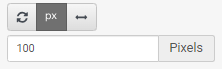
Sets a fixed size in pixels. You can type an integer value into the box, or use up or down arrows to increment or decrement size. These arrows are visible when the component has focus. Configures height to a fixed size, to grow as needed to display content, or to consume as much space as possible relative to other components, using weighting to influence size adjustments.
Setting Description 
Auto-sizing configures the component to shrink or grow in accordance with its contents. 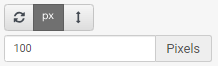
Sets a fixed size in pixels. You can type an integer value into the box, or use up or down arrows to increment or decrement size. These arrows are visible when the component has focus. Stretch allows a component to consume as much space as possible relative to other components, using weighting to influence size adjustments.
If two components are both set to stretch, they are both allocated 50% of the remaining space by default. This proportion can be adjusted by changing the weight value.
For example, if you set one component to a weight of 200, and the other to a weight of 100, then the first component occupies two thirds of the remaining space, while the other only takes one third. The first component appears twice the size of the other component, since its weight was two times the second component's weight.
Aligns a component to the left, right, or center, relative to its parent container.
Tip: A component cannot be vertically aligned to center if the Height setting of its parent container isAuto Sizing. To correct this, set the parent container's Height toStretchor to a fixed height inPixels.Setting Example 


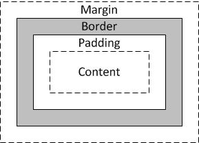
Margins set left, right, top, and bottom spacing around a border.
-
To optionally update all margin values at once, press the Set All button for Margin in the properties panel.

-
Click the value field for a margin. A spin control appears in that field.
-
Use the spin control to increase or decrease the margin. If Set All was selected, the change is applied to all margins.
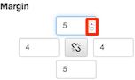
The component is immediately repositioned using its new margin setting.
Sets the visibility of a component based on the value of a Boolean (True or False) variable.
- Click the Layout property group. Below Visible, click Select Variable.
- Select a variable, or optionally create a new Yes/No variable and then assign that new variable to the Visible property.
- At runtime, the component is visible when the value of the variable is True. Conversely it is hidden when the variable's value is False.
Advanced
Value binds a component to the variable selected. For example, if you bind a text input component to a variable, the input box will always display the value of that variable, ignoring any placeholder text specified. The variable is automatically updated with text typed by the user, subject to validation processing.
Other controls, radio buttons for example, use Value with a Selected Value Text setting. When the radio button is selected at runtime, its "Selected Value Text" becomes the new value of the variable. This way, each radio button can assign a different value to same variable.
When a calendar control is bound to the variable, its value is set to the date selected by the control. Since variables can preset the value of visual controls and also be set by them, binding is a powerful and often-used technique.
The Includes Time setting configures a Date/Time component to prompt for date, time, and time zone, or just a date.
No When set to No, the agent is prompted to select a date only. When clicked, a popover calendar of dates appears for the agent to choose from.
Yes When set to Yes, the agent is prompted to select a date, time, and time zone.
Tip: When setting a callback time, the agent should select the time zone of the contact.
All components are enabled by default. The Disabled property binds a True/False variable to a component, to disable or enable it based on the runtime value of the variable.
-
-
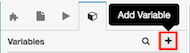
To create a True/False variable, click the Variables tab.
-
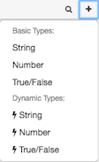
Click Add to add a variable.
-
Select True/False as the data type.
-
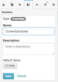
In the Name box, type a descriptive name.
-
Set Default Value to True or False.
-
If the variable is True, then the component is disabled.
-
If the variable is False, then the component is enabled.
-
- To save the variable, click Apply.
-
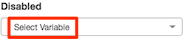
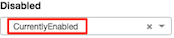
Assign the variable to the Disabled property. Below Disabled, click Select Variable.
-
Select the True/False variable.
-
To test your work, click Preview.The Change Action property allows you to set an action that executes when the state or value of this component is changed.
You can select a Scripter action, an Outbound Action, or a custom action. Outbound actions are not available unless the Outbound property is enabled.
Determines whether the user is required to type or select a value. The default is False, which means that user interaction is optional.
The user interface visually indicates whether user input is optional.
Optional input is indicated by a label below the component:
-