
Analytics as a service (A3S) Historical – Dashboard & Reporting Accelerator
A3S Historical delivers comprehensive contact center analytics through a fully managed service. It features the pre-built dashboard and reporting templates compatible with Tableau and Power BI environments. Our Snowflake-powered platform operates on a Bring Your Own Business Intelligence (BYOBI) model and seamlessly integrates with your preferred analytics tools through native connectors.
These turnkey reporting templates enable immediate visibility into your contact center performance from day one. Built on Snowflake’s robust architecture, these dashboards can be customized independently or enhanced through our professional services to meet your specific requirements.
Expand the following sections for true visualization samples of the dashboard & reporting templates.
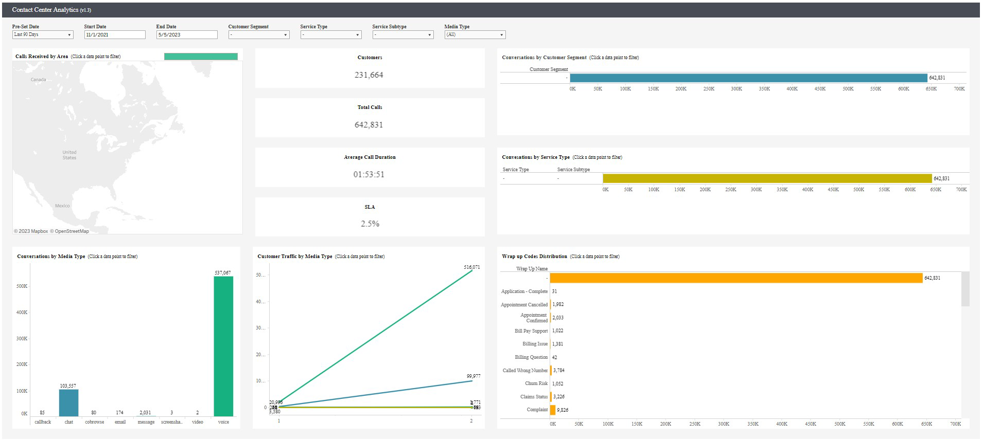
The contact center analytics dashboard gives contact center managers, supervisors, and agents a quick and detailed view of contact center metrics and KPIs including Customers, Total Calls, Average Call Duration, and SLA.
Columns in the view
| Column | Description |
|---|---|
| Calls Received by Area | Filter calls received based on geo-location. |
| Conversation by Media Type | Filter conversations based on media types such as co-browse, screen share, and voice. |
| Customer Traffic by Media Type | Filter customer traffic based on media types. |
| Conversation by Customer Segment | Filter conversations based on customer attributes including Gold, Bronze, and unique to your business. |
| Conversation by Service Type | Filter conversations based on service types. |
| Wrap up Codes Distribution | Filter conversations based on distribution of wrap up codes including new order and reschedule. You can use the wrap up codes from Genesys Cloud and the wrap up codes unique to your business. |
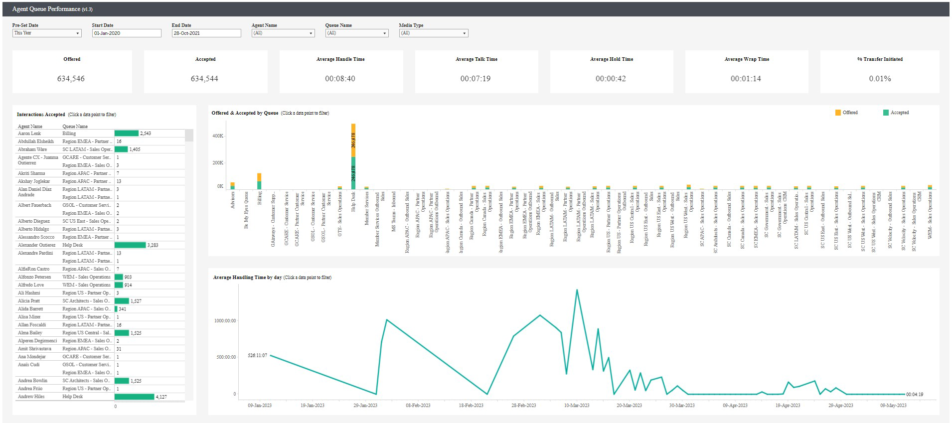
The agent queue performance dashboard provides a high-level overview of your agents and interactions handled out of your Genesys Cloud queues. The dashboard displays KPIs including Offered, Accepted, Average Handle Time, Average Talk Time, Average Hold Time, Average Wrap Time, and % Transfer Initiated.
Columns in the view
| Column | Description |
|---|---|
| Interactions Accepted | Provides a list of agents by name and queue with the number of interactions handled. |
| Offered & Accepted by Queue |
Displays breakdown of interactions offered vs breakdown of interactions accepted by the queue. You can discover any differences with flow-outs or agents not responding. |
| Average Handling Time by day |
Provides the average handling time of an interaction by the time of day. Filters by agent on Interactions Accepted view. |
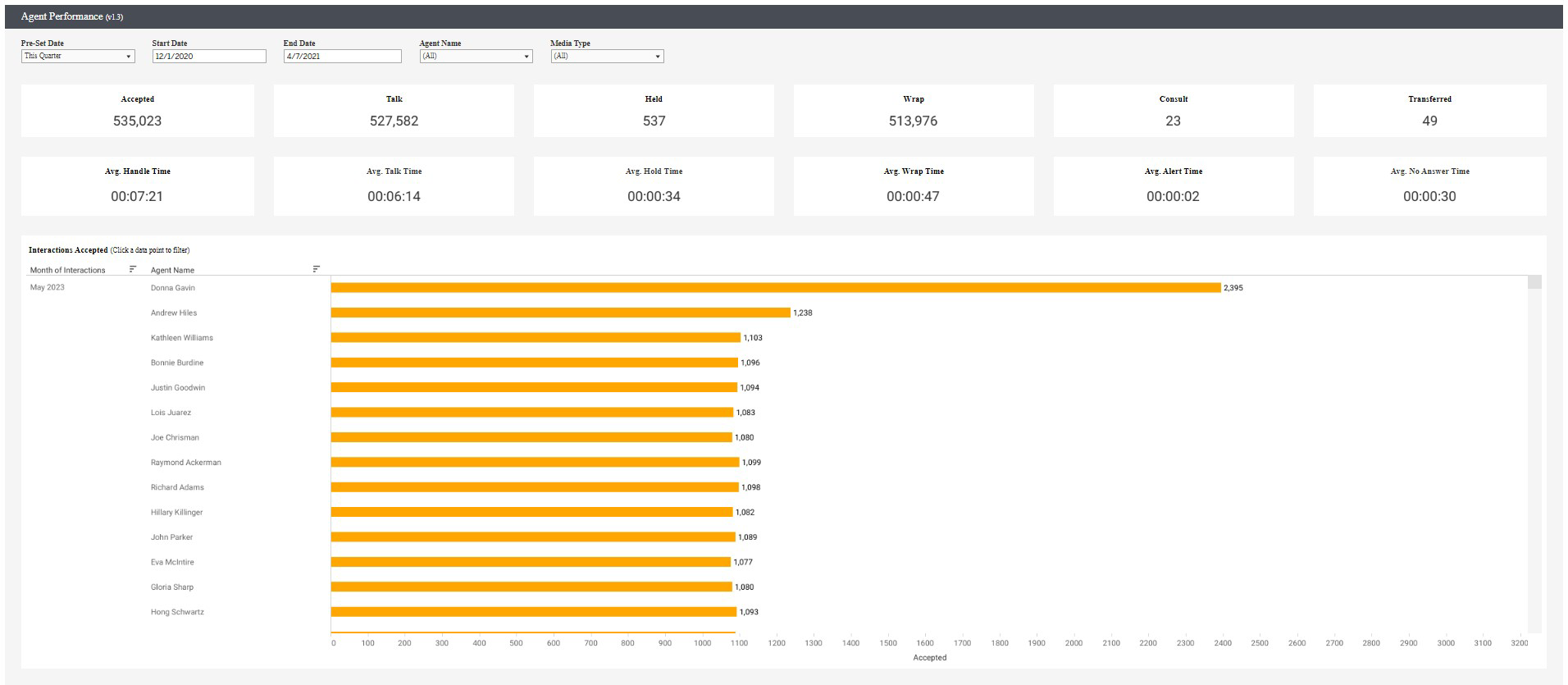
The agent performance dashboard provides context on agents as a whole and context not related to a queue specifically. The dashboard provides a list of common KPIs related to a contact center environment including Accepted, Talk, Held, Wrap, Consult, Transferred, Avg. Handle Time, Avg. Talk Time, Avg. Hold Time, Avg. Wrap Time, Avg. Alert Time, and Avg. No Answer Time.
Columns in the view
| Column | Description |
|---|---|
| Interactions Accepted |
|
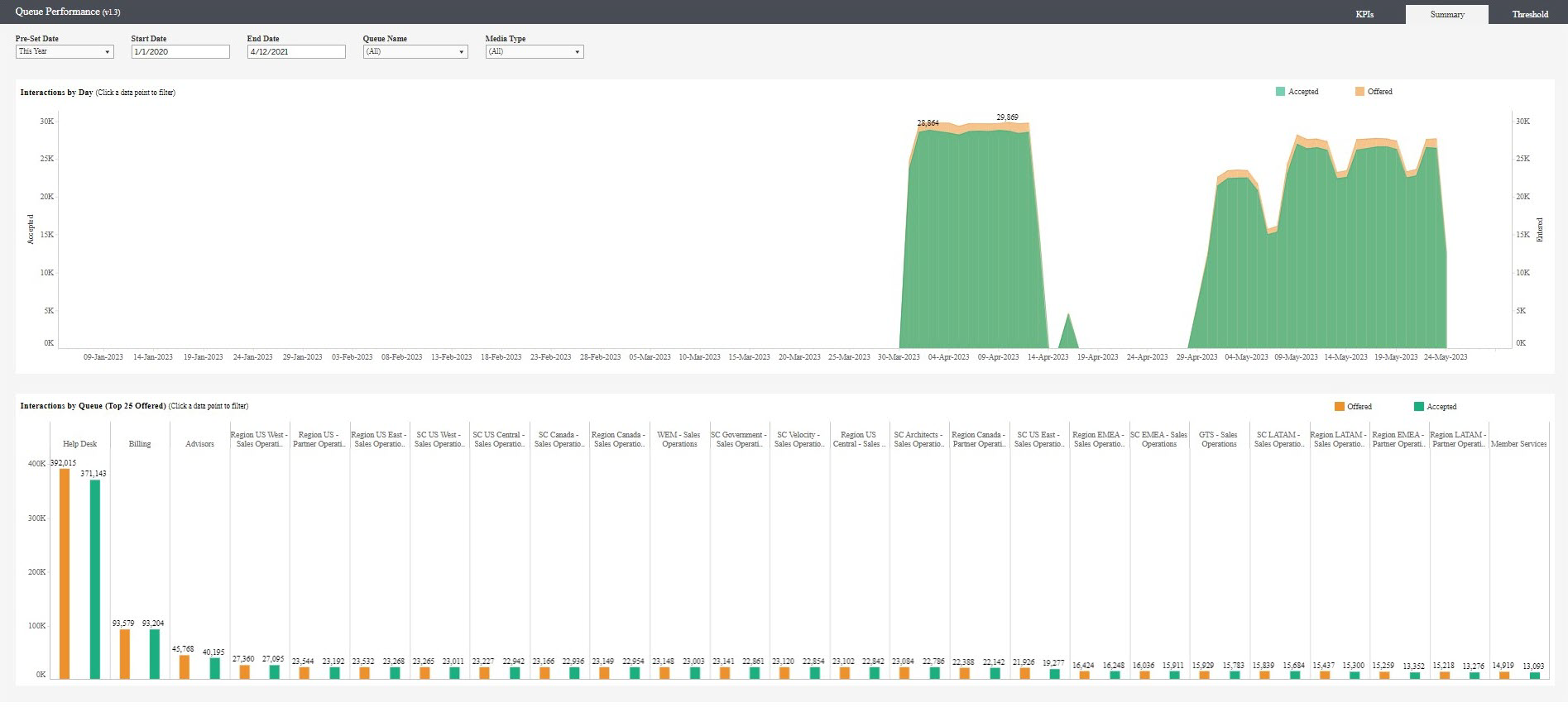
The queue performance summary dashboard provides a trend of a contact center’s volume over time.
Columns in the view
| Column | Description |
|---|---|
| Interactions by Day |
Provides details of interactions offered vs accepted by the day. Quickly view spikes in interaction volume and view accepted interactions once offered. |
| Interactions by Queue |
Provides details of the top 25 queues by volume. Each column is divided by the queue name allowing for a quick and easy-to-read view. |
The queue performance KPI dashboard provides details about a set of queue KPIs related to your contact center including Offered, Accepted, Abandoned, Flow Out, Transferred, % Abandoned Waiting, Service Level, Average Handle Time, Average Speed of Answer, and % Transfer Initiated.
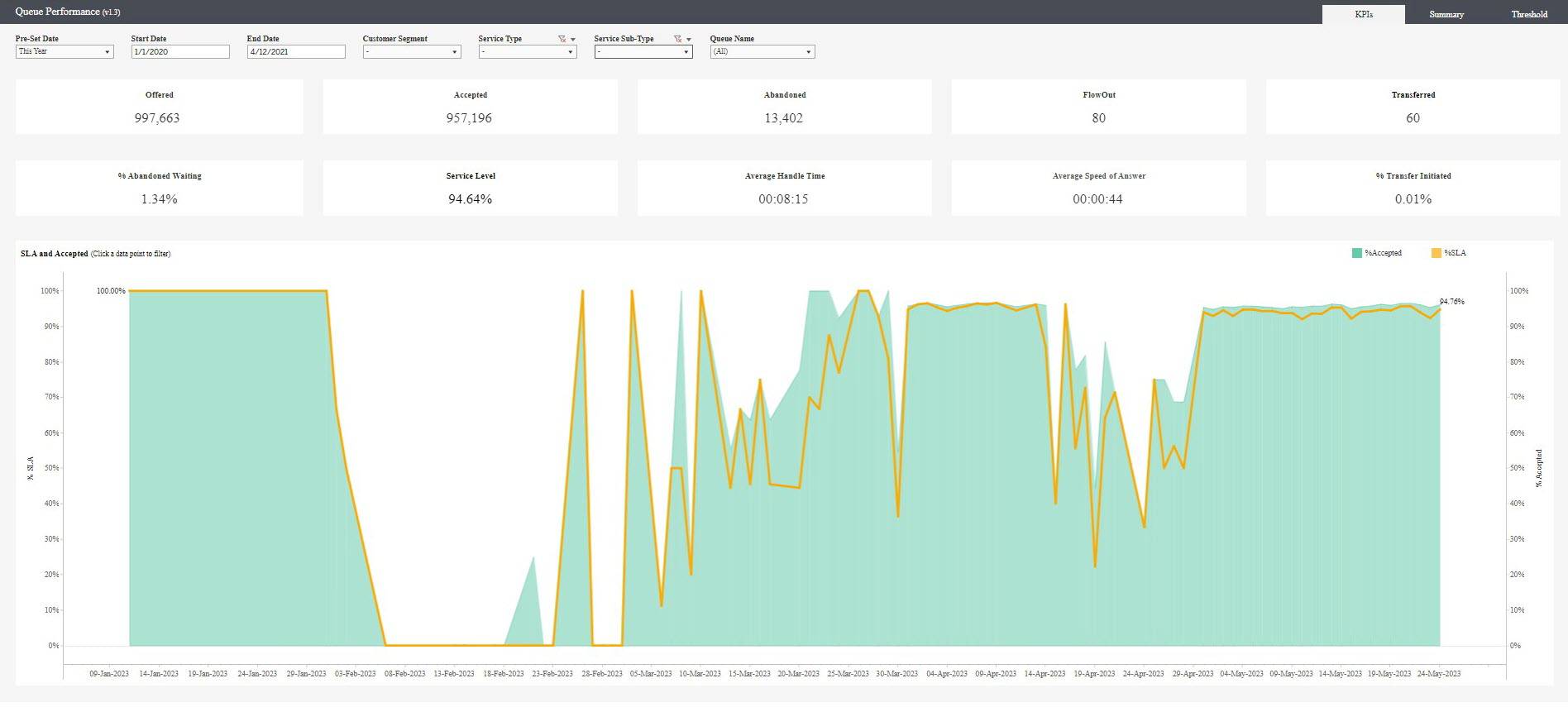
Columns in the view
| Column | Description |
|---|---|
| SLA and Accepted |
Provides trends of all the accepted interactions over the correlating service levels throughout a period of time. |
The Interactive Voice Response (IVR) summary dashboard provides details of IVR activity within your contact center. The dashboard displays the key KPIs including Total Calls, % Customer Disconnect, % Transferred to ACD, % IVR Disconnect, % Error, and Average Flow Time.
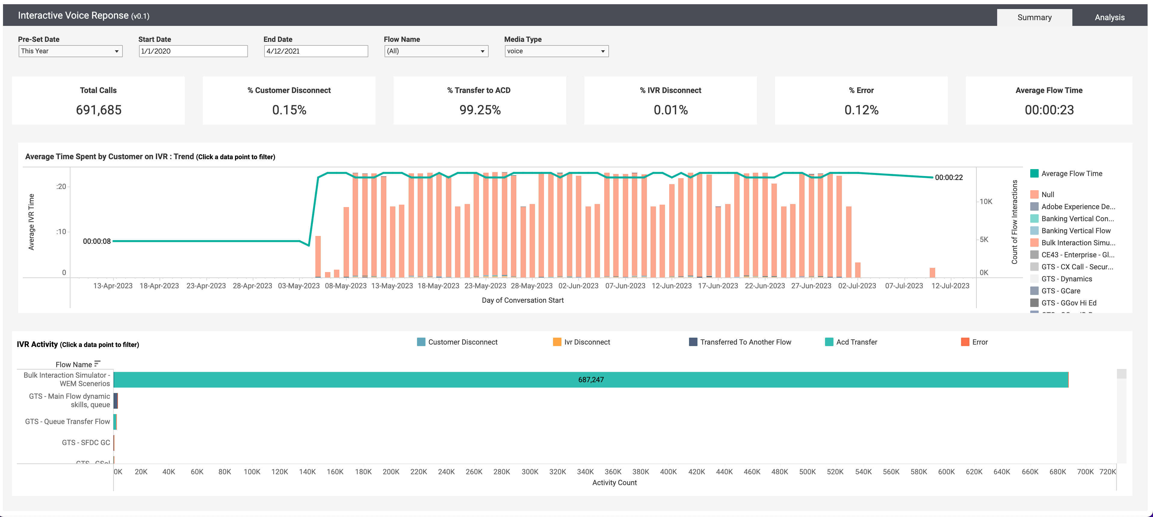
Columns in the view
| Column | Description |
|---|---|
| Average Time Spent by Customer on IVR |
Provides details on how long a customer spends in the IVR system on average based on time intervals ranging from year, quarter, month, day, and hour. You can view the IVR time as an aggregate number or filter by flow-clicking on a name or color. It also provides details of the total number of flow interactions. |
| IVR Activity |
Provides details on the total number of activities for each IVR activity per flow. Each flow provides details of the number of customers disconnects, IVR disconnects, transfers to another flow, ACD transfers, and errors. To filter the data in each flow, click an activity specified by the color in each flow. |