Navigate the Main Forecast page
- Genesys Cloud CX 3, Genesys Cloud CX 4, Genesys Cloud CX 3 Digital, Genesys Cloud CX 1 WEM Add-on II, Genesys Cloud CX 2 WEM Add-on I, or Genesys Cloud EX license
- The following permissions:
- Workforce Management > mainForecast > All
- Workforce Management > mainForecast > View
- Workforce Management > Planning group > View
- Analytics > conversationsAggregate > View
- Routing > Queue > View
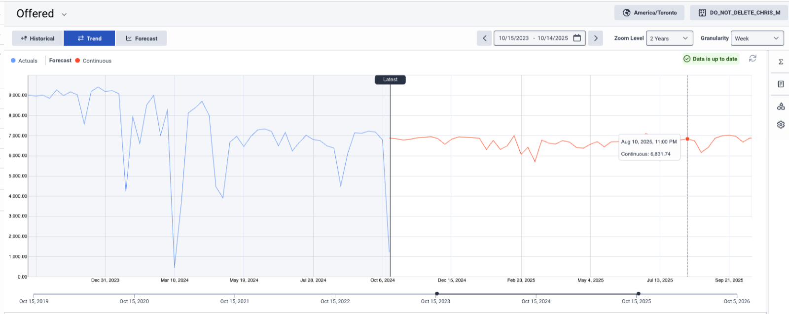
The Main Forecast view displays actual and forecasted aggregate interaction data. Forecasts contain 2 years (104 weeks) of data and actuals contain for up to 5 years (261 weeks) of data. The data includes offered and average handle time. Data is organized by planning groups and can be filtered by metric, dates, and planning groups.
The Main Forecast view has the following sections:
Click the image to enlarge.
| Option | Description | ||||||||||||
|---|---|---|---|---|---|---|---|---|---|---|---|---|---|
| Main forecast metric selector |
The Main Forecast view displays one metric at a time. Use the metric selector drop-down list available on the upper left corner of the Main Forecast page to switch between Offered and Average Handle Time metric. The Offered metric is displayed by default. |
||||||||||||
| Time zone selector |
Select a time zone from the drop-down list on the upper right corner. This field displays the forecast in the time zone of the Business Unit by default. |
||||||||||||
| Business Unit selector |
Access the data for a specific business unit by selecting it from the Business Unit selector on the upper right corner. |
||||||||||||
| Main Forecast views |
The Main Forecast views include:
|
||||||||||||
| Date Range Selector |
Filter data to a specific date range. In addition, upon mouse hover over, view the business unit time zone and display time zone details. |
||||||||||||
| Zoom level Selector |
Control the range of the data that you want to view on the graph. You can use the different pre-configured zoom levels to quickly navigate the graph. The zoom level impacts the granularity displayed in the forecast chart and when the zoom level does not match the pre-defined options, it is blank. You can also zoom in and out of the chart using the Ctrl and mouse scroll wheel (Windows) and command + (Mac). |
||||||||||||
| Granularity Selector |
Control the granularity of the data you want to view. The following table illustrates the supported granularities per zoom level:
The Main Forecast page supports:
|
Click the image to enlarge.
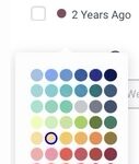
This section allows selection of up to two additional datasets from the following two categories:
Click the image to enlarge.
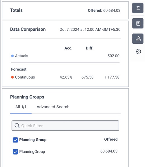
The right side of the Main Forecast view displays several widgets that provide additional information and options.
| Widget | Description |
|---|---|
| Totals widget |
View forecast totals for the selected metric based on the selected date range. |
| Data Comparison widget |
View graph values by hovering the mouse over the graph. View details such as continuous forecast, actuals, and any additional selected datasets. The widget displays data corresponding to the default data point. The default data point is Latest or middle of the graph, if Latest is not visible based on the selected date range. If both forecast and actuals are available for the specified data point, the comparison widget includes comparative analysis data, such as difference and accuracy. |
| Planning Group widget |
Select planning groups to filter the data. Use the Quick Filter to find planning groups based on their name. Use the Advanced Search option to find planning groups based on Media Type, Queue, Language, and Skills.
|
| Display Options widget |
Reset the Main Forecast view to defaults using the following options:
|


