
Vertical stack container script component
A vertical stack is a parent container that arranges child components vertically. To arrange components horizontally, use a horizontal stack container.
Note: Every script page has a default vertical stack container that contains everything added to that page. You cannot delete this root component, but you can modify its properties and add components to it.
-
Because the default container is a Vertical Stack container, you may not need to add an extra one. To add another, click the Vertical Stack Container icon on the component toolbar.

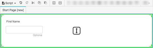
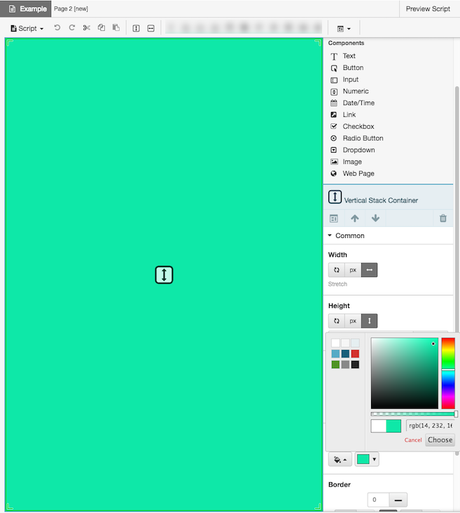
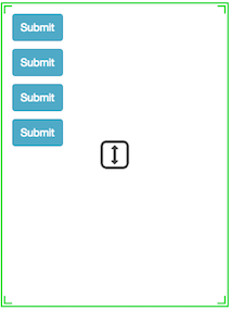
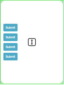
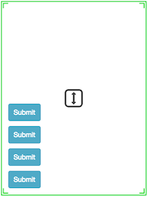
When you select a vertical stack container, the script editor shows a downward directional indicator. The arrow indicates how new components added to the control align relative to one another.
For a vertical stack, the script editor positions new components below the previous component. If you add a text component, followed by an input, the editor stacks the controls vertically.
-
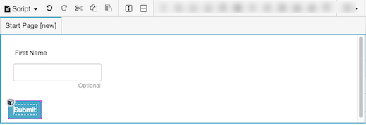
If you add another component using the toolbar, the container places it below the currently selected item.
-
Optionally set properties of this component.
Common
Configures width to a fixed size, to grow as needed to display content, or to consume as much space as possible relative to other components, using weighting to influence size adjustments.
Setting Description 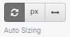
Auto-sizing configures the component to shrink or grow in accordance with its contents. For example, the width of a label can grow depending up on how much text it contains. 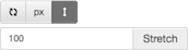
Stretch allows a component to consume as much space as possible relative to other components, using weighting to influence size adjustments.
If two components are both set to stretch, they are both allocated 50% of the remaining space by default. This proportion can be adjusted by changing the weight value.
For example, if you set one component to a weight of 200, and the other to a weight of 100, then the first component occupies two thirds of the remaining space, while the other only takes one third. The first component appears twice the size of the other component, since its weight was two times the second component's weight.
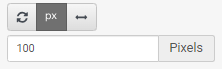
Sets a fixed size in pixels. You can type an integer value into the box, or use up or down arrows to increment or decrement size. These arrows are visible when the component has focus. Configures height to a fixed size, to grow as needed to display content, or to consume as much space as possible relative to other components, using weighting to influence size adjustments.
Setting Description 
Auto-sizing configures the component to shrink or grow in accordance with its contents. 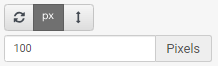
Sets a fixed size in pixels. You can type an integer value into the box, or use up or down arrows to increment or decrement size. These arrows are visible when the component has focus. Stretch allows a component to consume as much space as possible relative to other components, using weighting to influence size adjustments.
If two components are both set to stretch, they are both allocated 50% of the remaining space by default. This proportion can be adjusted by changing the weight value.
For example, if you set one component to a weight of 200, and the other to a weight of 100, then the first component occupies two thirds of the remaining space, while the other only takes one third. The first component appears twice the size of the other component, since its weight was two times the second component's weight.
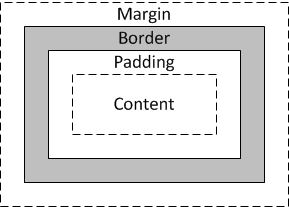
Padding defines the space between the inside border and content. A margin sets spacing outside a border, whereas padding adds space inside a border.
-
To optionally update all padding values at once, press the Set All button for Padding in the properties panel.

-
Click the value field for a border item. A spin control appears in that field.
-
Use the spin control to increase or decrease border width. If Set All was selected, the change is applied to all values.
The component is immediately repositioned using its new padding setting.
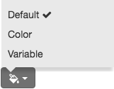
Sets background color to one of the following:
-
Default—Assigns the default color.
-
Color—allows you to select from a palette of common colors, or choose your own by entering RGB values or by moving the color picker to a new spectrum position. Setting the color for text and background is a property in the Appearance panel. This property panel is only available for components that have the color functionality.
Click Choose to assign the current selection.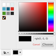
-
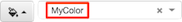
Variable—assigns a color stored in a string variable. For example, to assign dark blue:
-
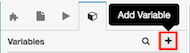
Click the Variables tab.
-
Click + to add a variable.
-
Select String as the type of value the new variable stores.
-
Type a descriptive name in the Name box.
-
Set Default Value to 0000FF or #0000FF—which is the hexadecimal code for dark blue.
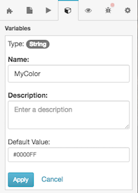
- Click Apply.
-
Assign the variable to this color property.
-
To change the background color of a script page
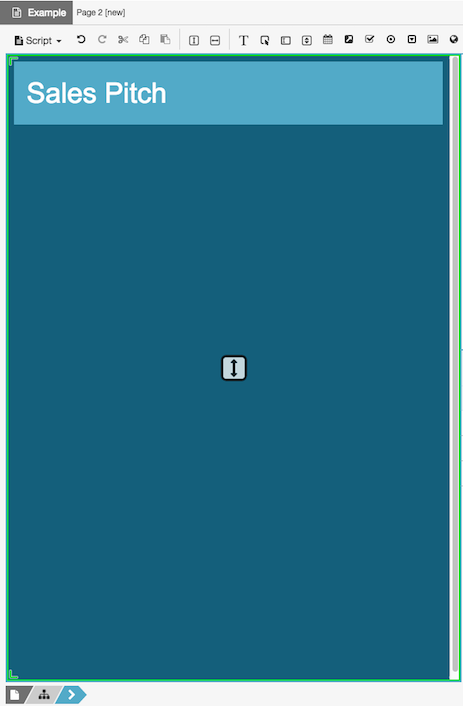
To set the background color of an entire page, assign a background color to its root vertical container.
-
In the breadcrumbs bar, click the root container icon.

-
Under Common or Appearance, assign a different Background color.
You can create interesting effects by assigning different background colors to other containers.
Border defines the space between padding and margin. A margin sets spacing outside a border, whereas padding adds space between the border and the component.
-
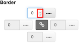
To optionally update all border values at once, press the Set All button for Border in the properties panel.
-
Click the value field for a border item. A spin control appears in that field.
-
Use the spin control to increase or decrease border width. If Set All was selected, the change is applied to all padding values.
The component is immediately repositioned using its new border setting.
Layout
Configures width to a fixed size, to grow as needed to display content, or to consume as much space as possible relative to other components, using weighting to influence size adjustments.
Setting Description Auto-sizing configures the component to shrink or grow in accordance with its contents. For example, the width of a label can grow depending up on how much text it contains. Stretch allows a component to consume as much space as possible relative to other components, using weighting to influence size adjustments.
If two components are both set to stretch, they are both allocated 50% of the remaining space by default. This proportion can be adjusted by changing the weight value.
For example, if you set one component to a weight of 200, and the other to a weight of 100, then the first component occupies two thirds of the remaining space, while the other only takes one third. The first component appears twice the size of the other component, since its weight was two times the second component's weight.
Sets a fixed size in pixels. You can type an integer value into the box, or use up or down arrows to increment or decrement size. These arrows are visible when the component has focus. Configures height to a fixed size, to grow as needed to display content, or to consume as much space as possible relative to other components, using weighting to influence size adjustments.
Setting Description Auto-sizing configures the component to shrink or grow in accordance with its contents. Sets a fixed size in pixels. You can type an integer value into the box, or use up or down arrows to increment or decrement size. These arrows are visible when the component has focus. Stretch allows a component to consume as much space as possible relative to other components, using weighting to influence size adjustments.
If two components are both set to stretch, they are both allocated 50% of the remaining space by default. This proportion can be adjusted by changing the weight value.
For example, if you set one component to a weight of 200, and the other to a weight of 100, then the first component occupies two thirds of the remaining space, while the other only takes one third. The first component appears twice the size of the other component, since its weight was two times the second component's weight.
Aligns a component to the left, right, or center, relative to its parent container.
Tip: A component cannot be vertically aligned to center if the Height setting of its parent container isAuto Sizing. To correct this, set the parent container's Height toStretchor to a fixed height inPixels.Setting Example 


Child arrangement determines how the contents of a container are arranged if the container has extra space.
This setting is disabled if the width and height of a container is auto-sizing. Auto-sizing tells the container to expand to the size of the elements it contains. Since that allows no extra space, child arrangement properties have no meaning, and are disabled. To enable child arrangement, set the container's width in pixels, or to stretch.
When a container has extra space, you can select one of the following to influence how space is distributed:
-
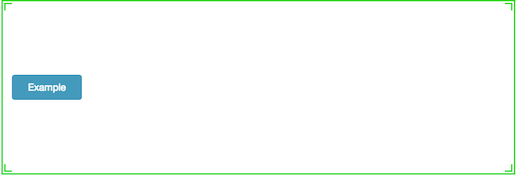
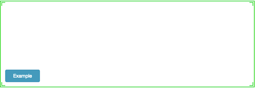
Start—Contents are distributed to the start of the container.
-
Center—Contents are distributed to the center of the container.
-
End—Contents are distributed to the end of the container.
Margins set left, right, top, and bottom spacing around a border.
-
To optionally update all margin values at once, press the Set All button for Margin in the properties panel.
-
Click the value field for a margin. A spin control appears in that field.
-
Use the spin control to increase or decrease the margin. If Set All was selected, the change is applied to all margins.
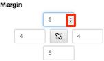
The component is immediately repositioned using its new margin setting.
Sets the visibility of a component based on the value of a Boolean (True or False) variable.
- Click the Layout property group. Below Visible, click Select Variable.
- Select a variable, or optionally create a new Yes/No variable and then assign that new variable to the Visible property.
- At runtime, the component is visible when the value of the variable is True. Conversely it is hidden when the variable's value is False.
Padding defines the space between the inside border and content. A margin sets spacing outside a border, whereas padding adds space inside a border.
-
To optionally update all padding values at once, press the Set All button for Padding in the properties panel.
-
Click the value field for a border item. A spin control appears in that field.
-
Use the spin control to increase or decrease border width. If Set All was selected, the change is applied to all values.
The component is immediately repositioned using its new padding setting.
Appearance
Sets background color to one of the following:
-
Default—Assigns the default color.
-
Color—allows you to select from a palette of common colors, or choose your own by entering RGB values or by moving the color picker to a new spectrum position. Setting the color for text and background is a property in the Appearance panel. This property panel is only available for components that have the color functionality.
Click Choose to assign the current selection. -
Variable—assigns a color stored in a string variable. For example, to assign dark blue:
-
Click the Variables tab.
-
Click + to add a variable.
-
Select String as the type of value the new variable stores.
-
Type a descriptive name in the Name box.
-
Set Default Value to 0000FF or #0000FF—which is the hexadecimal code for dark blue.
- Click Apply.
-
Assign the variable to this color property.
-
To change the background color of a script page
To set the background color of an entire page, assign a background color to its root vertical container.
-
In the breadcrumbs bar, click the root container icon.
-
Under Common or Appearance, assign a different Background color.
You can create interesting effects by assigning different background colors to other containers.
Border defines the space between padding and margin. A margin sets spacing outside a border, whereas padding adds space between the border and the component.
-
To optionally update all border values at once, press the Set All button for Border in the properties panel.
-
Click the value field for a border item. A spin control appears in that field.
-
Use the spin control to increase or decrease border width. If Set All was selected, the change is applied to all padding values.
The component is immediately repositioned using its new border setting.
-